
Examples of a Treemap Chart to Visualize Quantitative Values
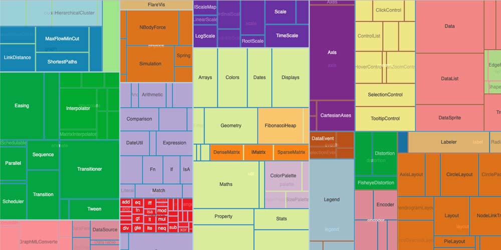
Microsoft Excel provides many chart types to visualize the cell's data better. When it comes to quantitative variables, the best option is a Treemap Chart since we can see all the categories in terms of relationship and size. This diagram is excellent for many reasons. In this article, we explain why and when to use it, its advantages, and give you some examples.
Examples of a Treemap Chart to Visualize Quantitative Values
What is a Treemap Chart?
A treemap is a data visualization diagram that configures a chart using hierarchical data in rectangles of different sizes. This technique is also called Nesting. A treemap chart uses colored and nested rectangles, which you can consider as branches.
Why Are Treemap Charts Relevant for Your Business?
Below, you will find some reasons why you should use this descriptive type of chart to understand some statistics of your business.
- Treemap charts are fundamental to your company or project when you compare data in two quantitative values. This way, each rectangle represents the quantity of a specific item and it’s easily comparable with the rectangles next to it.
- Using a treemap chart is an excellent method to understand how your business progresses.
- Your business has a wide area size and a large amount of hierarchical data to improve processes and statistics.
- A treemap chart provides a high-level summary of the similarities and anomalies inside each category, sub-branch, and between multiple categories.
- You can organize all the data of your organization at several levels.
Components of a Treemap Chart
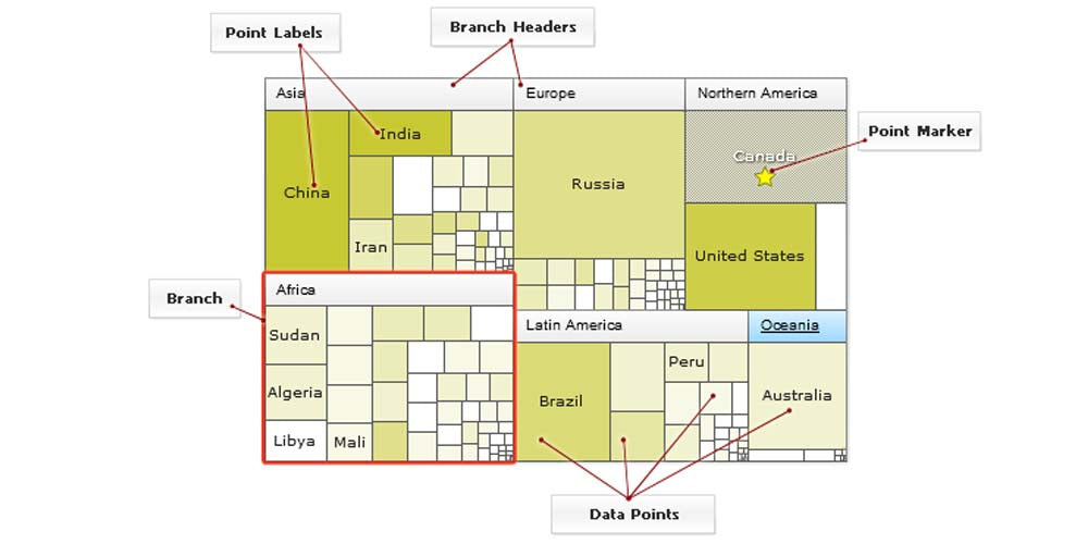
To properly understand the treemap chart, we're now providing you with a quick overview of its components.
- The chart title. It’s the general title of the chart, organization, frame, or diagram. It should cover all the aspects of categories and subcategories.
- The plot area or parent node. The plot area is the section where the visual representation takes place. Here you visualize the rectangles by color and size.
- The legend: It’s the part that helps you to distinguish one data series from another. Sometimes it’s represented by a sliding color scale.
- The rectangles, or data points. Each rectangle represents a specific item, generally through two numerical values. More giant rectangles represent more quantity or percentage than smaller rectangles.
- Point labels. These correspond to the names of the rectangles.
- The color. Each color represents a different category or a level category.
Characteristics of Treemap Charts
Treemap charts are characterized by specific elements and nodes, which we will describe below:
- Treemap charts display hierarchical data using nested rectangles.
- Each rectangle represents two numerical values.
- The size and the plot colors of the rectangles are strictly related to the quantitative variables of the measure.
- The data can be multi-layered through a series of nested rectangles where “child elements” are tiled along with “parent elements.”
- The section of each rectangle is proportional to the percentage of the rectangle compared to others.
- A branch is made up of a sum of subcategories.
- Rectangles are organized in decreasing order, with bigger ones in the top left corner and small ones in the bottom right corner.
Some Examples of Treemap Charts
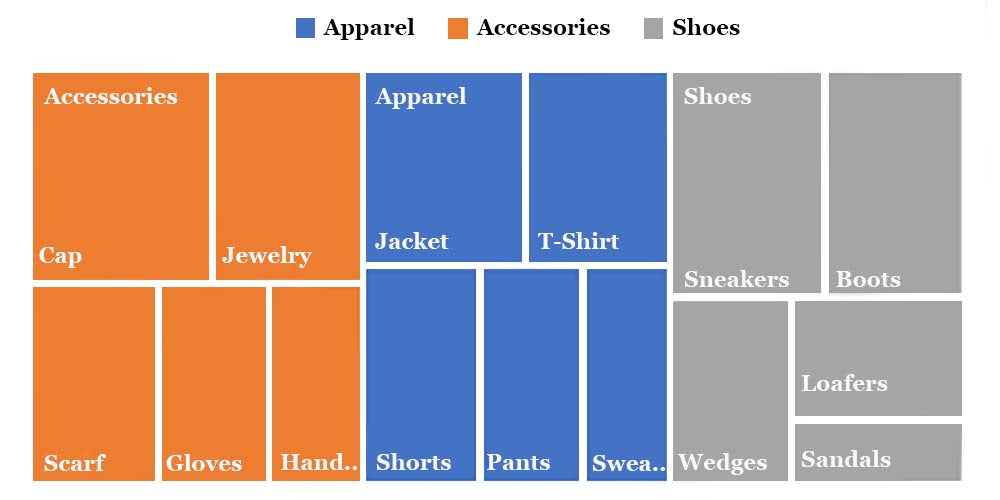
The above chart shows the category sales for the best-selling products of a famous apparel brand. Each rectangle showcases two quantitative variables: the average sales —represented by the dimensions of the rectangle—and the percentage growth in the sales of a product compared to the previous seasons—represented by the rectangle's color.
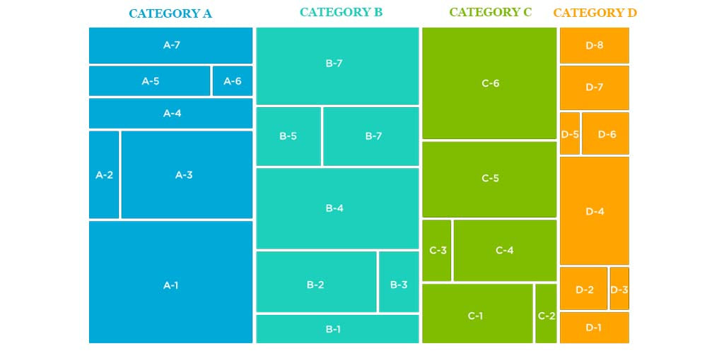
This is another tree structure example of a treemap chart. It's very similar to the chart type we see above, but the categories are ascending to the highest level categories. Still, each triangle represents an item within a specific category. With this example, users quickly understand how a treemap chart works.
How to Create a Treemap Chart in Microsoft Excel
As a treemap chart is a hierarchical visual representation of a data tree and specific data points, it’s best to begin with the most relevant information or category. Then, it would help if you used the first column – column A – to insert the main categories. Then use the subsequent columns to insert the subcategories or corresponding numerical values.
To create your treemap chart, select your data. Then, go to Insert tab > Insert Hierarchy Chart > Treemap.
By default, the name of the chart is Chart Title. Right-click that text box and enter the name of your preference. Now, you can select a style, a different layout, or a color scheme for the treemap.
Select the treemap chart and head to the Chart Design tab that displays. You can use various tools in the ribbon to personalize and customize your treemap.
You can configure a different color for top levels and use the layout of the data labels between the categories by right-clicking on the rectangles on the chart.
Note. Another way to create your treemap chart is to use Recommended Charts. Go to Insert > Recommended Charts > All Charts.
Getting Microsoft Excel on RoyalCDKeys
Since on RoyalCDKeys we know that purchasing an official version of Microsoft Office and Excel could be expensive, we offer a reliable key to the software.
Microsoft Office 2021 includes all the most used office applications, such as Word, Excel, and Powerpoint. Then, with this Microsoft Suite, you can create value treemap charts based on the sheet you want.
This reliable version of Microsoft Office 2021 Professional Plus Key Retail Global at €6,80 is available on RoyalCDKeys.
Advantages of Treemaps Charts
- Thanks to treemap charts, you can identify data values and patterns and discern relationships between different components through hierarchically organized data.
- It is easy to display hierarchies, even when showing dozens of parent categories and hundreds of data points or sub-branches.
- Treemap charts accurately display elements and spot patterns. For example, how many units sold correspond to a determined period.
Disadvantages of Treemap Charts
- All the values in a specific variable representing the size of the rectangle must be positive.
- Treemap charts do not show the hierarchical levels as clearly as other charts, such as the Sunburst Diagram or the Tree Diagram.
- Readability can be challenging to understand, like many other tree maps. Linear data plots are easier to read than large and wide ones.
Final Thoughts
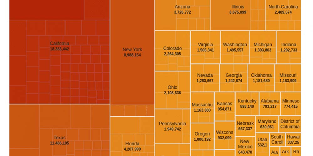
You can use other charts for similar purposes and plot hierarchical data, such as the multi-level pie chart and the drag-node chart. Still, these charts have another format and readability can be challenging. However, these charts present a space constraint as the quantity of data points increases further than a specific limit.
After sorting options, the best alternative to generate a chart for viewing a large number of data is a treemap chart. But feel free to check alternative diagrams, which we discuss in other articles in RoyalCDKeys.
Browse our blog for more related articles, templates, chart types, and helpful resources you or your business can leverage. Double-click on the link above and access other papers and more!


